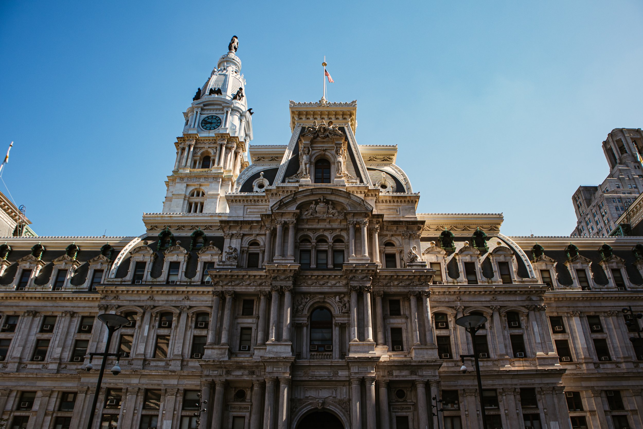
philadelphia courts
landing page
ux/ui interactive design
art direction: bryan satalino
design partners: axxel david, vy le, & brett sweeney
A collaboration consisting of Temple University’s law students and Tyler School of Art and Architecture, The Philadelphia Court System calls for a redesign for the landing page of their website. For such an importance website, accessibility and an easy way to navigate are essential.
This new website would consist of the potential for a new logo, color palette, typography, and several other design elements to push the branding of The Philadelphia Court System in a progressive yet professional profile.
Introduction
Our goal is to create a fully functioning prototype of the Philadelphia Courts landing page. Breaking into groups, each Tyler School of Art and Architecture graphic design student group would present their own unique layout both inspired by the elements of the old website merged their own original visual elements. Each group would be paired with a third-year law student at Temple University’s Beasley School of Law to get their insight on the layout based on their research of the target audience and their overall knowledge of the governmental system in a branding aspect.
Utilizing the market research from the law students as well as the visual perspective from the design groups, a key method of user-friendly strategy would be implemented within the current frameworks that exist on the philacourts.gov website to give the finalized look of an accessible governmental website.
Identifying the Problem
When users visit a governmental website, the most important goal of that user experience is accessibility and a sense of actionable empathy for those who are affected by circumstances surrounding the governmental system and its law. The difficulties of the usability of the Philadelphia Courts System confuses the user experience and creates disorganization of the website’s elements within the current frameworks. The entire website is inaccessible and has a very complicated navigation system. Important key elements are hidden within a system of multiple landing pages and tabs that obscure the organization of where and how the user is supposed to find the information that is most helpful to them.
The current website also had problems with how it branded itself. We noticed that the website’s logo was a problem as the current logo is a representation of the website’s URL and not the Philadelphia Court’s actual URL. This is extremely misleading to the user as well as a poor logo to represent the actual branding of the Philadelphia Court.
Branding Process
After researching examples of good design practice from judiciary websites, we were able to find inspiration through their own usage of color, font treatment, and how each section of the website felt within their own block of content. On the original website, the composition of the design elements on the website are also too similar to each other, alluding to a weird blending where images, typography, and graphic elements can’t be defined as their own.
The new branding gives each of those design elements their own signature. The logo is a more representative symbol of the Philadelphia Courts and integrates the new colors and fonts used within the website allowing for a constant flow of branding. The separate graphic elements are also a lot easier to read and interact which allows for users to quickly and efficiently navigate throughout the frameworks.
Wireframes
Wireframing became one of the most important aspects to the redesigning process as most of the content we were using already existed on the Philadelphia Courts website.
By wireframing the original website, we start to get a better understanding of how information was handled and how we can effectively change the page without losing important features. Within our first proposed website design, our wireframe showcases how the existing elements on the Philadelphia Courts have evolved into their own elements within the framework and how their organization constructs the entirety of the information made to be more available to the user. In the finalized version, there’s a clear difference in the framework when comparing it to the original. Each element and aspect of the website has its own personality and its effective way of being user friendly in terms of informative and accessibility.
Final Deliverables
The final deliverables is a fully designed mobile and desktop landing page for the Philadelphia Courts website. This newly developed website gives the Philadelphia Courts a new branding look as well as a more attractive website for users to maneuver and interact with. With a new logo, typography, and color palette the website feels more modern and professional. Each section of the framework allows for each element to breath and bring as much user interaction with it as possible.
Conclusion
This project was a unique design thinking exercise as the main focus was on the user experience and how much accessibility they were receiving through the design format rather than focusing on solely creating creative design. It was also a great project to introduce design students to how design can be implemented within fields such a governmental firms and practices and how it elevates their own environment and practices. A creative and informative collaboration between the students of Tyler School of Art and Architecture and Beasley School of Law at Temple University wih Philadelphia’s own Philadelphia Court’s System.


